
- Szczegóły
- Odsłony: 138
1. Search Setup

- Simply publish the default Joomla search module to the search position.
2. Column Menu Setup
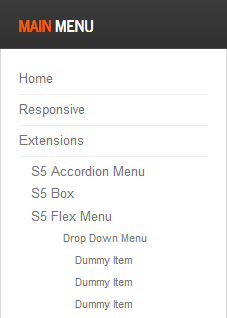
- Publish any menu module to the main body module positions on your site.
- There should be no menu style suffixes applied under advanced parameters.
- The menu style should be set to list.
3. Bottom and Custom_1 Menu Setup

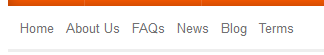
- Publish any menu to the 'bottom_menu' or 'custom_1' positions.
- There are no menu style suffixes applied under advanced parameters.
- The menu style should be set to list
- Szczegóły
- Odsłony: 128
Many modern browsers such as Firefox4 of IE9 already support CSS3 natively, but where does that leave IE7 and IE8? Thankfully a great solution called CSS PIE (Progressive Internet Explorer) has been introduced and is integrated into this template. Simply put, CSS PIE a script that upgrades IE7 and 8 to support most CSS3 formatting. There are slight variations and some CSS3 formatting isn't supported, but overall it does a great job and allows us to extend CSS3 support to IE7 and 8.
- Szczegóły
- Odsłony: 161


I like what I see! I want to JOIN TODAY.
- Szczegóły
- Odsłony: 181
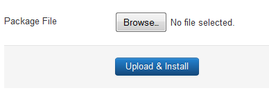
- Download the installation package from our download section.
- Once the download is complete go to the backend of Joomla.
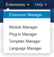
- Navigate through your menu system to Extensions/Extensions Manager.
- Once at the installation screen click the browse button and navigate to where you downloaded the template file.
- Once you have the file selected click 'Upload File and Install'
- Navigate through your menu system to Extensions/Template Manager.
- Find the radio button next to the newly installed template.
- Click on the Default button at the top right of the screen and you're done!
The template is now installed, now let's set it as the default template:
- Szczegóły
- Odsłony: 135
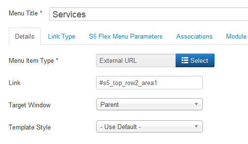
- #s5_header_area1
- #s5_top_row1_area1
- #s5_top_row2_area1
- #s5_top_row3_area1
- #s5_center_area1
- #s5_bottom_row1_area1
- #s5_bottom_row2_area1
- #s5_bottom_row3_area1
- #s5_footer_area1
Screenshot of admin area of an external menu item with DIV reference entered:
- Szczegóły
- Odsłony: 154
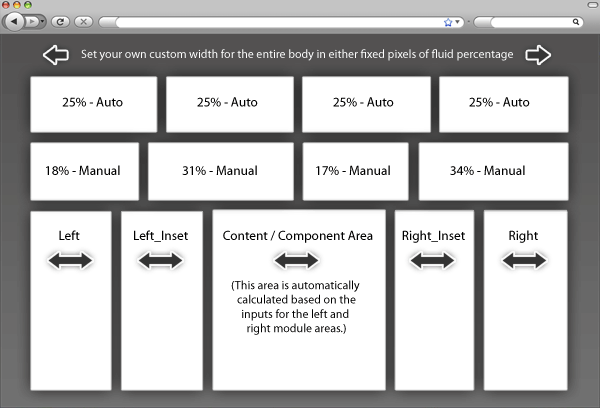
Fixed or Fluid Width
This template has the ability to set the entire width of your set to either a fixed pixel width or a fluid percentage width. You can set the width to any size you want.Column Widths
You may also set the widths of the following positions to any width that you need to: left, left_inset, right, and right_inset. You may set them to any width you need to. Columns can either be set to a fixed px width or they can be set to a fluid percentage width. If you are enabling the responsive layout we recommend setting these to percentage width.Row Widths
This template comes loaded with module positions, many of which appear in rows of 6 module positions. Any row that contains 6 module positions can have it's row columns set to automatic widths or manual. For example, in the picture below the first row shows 4 modules published and since it's set to automatic each is set to 25% width. The second row shows a manual calculation for each module in the row. Again, you may do this for any row that contains 6 modules. If you setup a manual calculation they must total to 100%. Not all 6 modules need to be used, as shown below.
All of this is done very easily in the template configuration.
Strona 2 z 3